I do not use piece count as the whole answer
When I assign or review a difficulty, I begin with the board size, but I also inspect the image. A larger grid creates more candidates and smaller fragments. It does not guarantee that every decision is hard. A clear image with many distinctive regions can be easier to organise than a smaller image made from one repeated texture.
JPW Games currently generates 25 pieces for Easy, 64 for Medium, 100 for Hard, and 144 for Expert. I treat those labels as product tiers. Within a tier, the picture still changes the real experience.
I look for visual landmarks
A landmark is any detail I can identify and place quickly: a face, a red barn, a bridge, a bright balloon, or a strong horizon. Images with several separated landmarks give me natural starting groups.
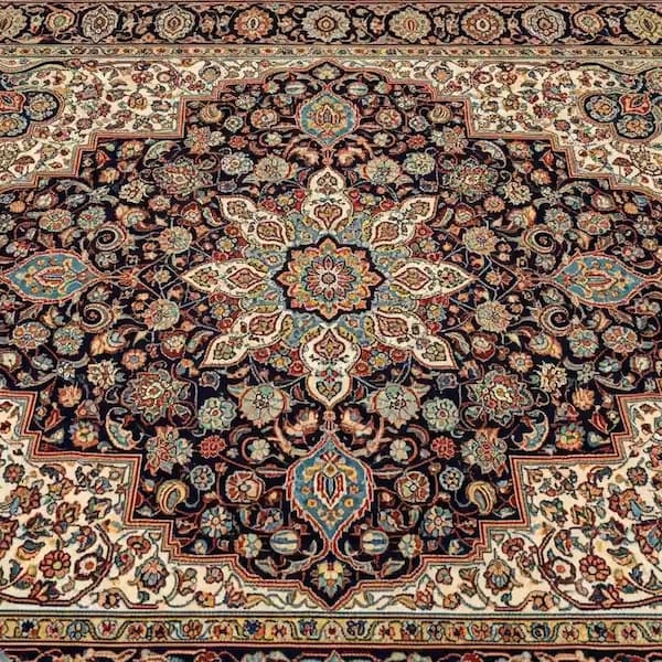
Hot Air Balloons is a good example. Each balloon can become an anchor, and the open sky separates those coloured shapes. In a dense carpet pattern, many fragments contain plausible motifs without revealing exactly where they belong.
I therefore ask how many pieces contain unique information. If most pieces look interchangeable at first glance, the puzzle demands a longer search.
I measure repetition
Repeated windows, leaves, petals, stones, waves, and decorative motifs reduce certainty. A piece may clearly belong to a building or field but still have many possible positions within that region.
My most demanding catalogue images combine repetition with a large board:
- Persian Carpet repeats shapes and colours across a symmetrical design.
- Sunflower Field repeats similar flowers and stems.
- New York City and Singapore Marina contain dense architectural detail.
- Northern Lights includes broad dark areas and smooth colour transitions.
- Fruit Basket crowds many rounded objects, leaves, and highlights together.
I do not claim this ranking comes from a player experiment. It is my editorial assessment of the source images and the game grid.
I check contrast and boundaries
Strong boundaries make classification easier. A white waterfall against dark rock gives me a clear region even when the water itself contains subtle texture. A pale sky fading gradually from one blue to another offers fewer decisive lines.
I look for:
- High contrast between neighbouring regions.
- Long continuous lines, such as roofs or horizons.
- Changes in texture, such as water meeting rock.
- Distinctive colours that appear in only one part of the image.
If those signals are weak, I expect the solver to rely on smaller differences and more repeated scanning.
I account for the centre crop
The game converts each source image into a centred square before slicing it. That can change difficulty. A landmark near the original edge may disappear, leaving more sky, foliage, or background texture than the uncropped preview suggests.
This is why I should evaluate the exact board crop, not only the original file. It is also why per-image focal points would improve both composition and difficulty consistency.
I consider the device
A 144-piece board does not feel identical on a large monitor and a phone. On a smaller screen, each tile occupies fewer physical pixels, finger input can cover the target, and zoom becomes part of the task.
I separate image difficulty from interaction difficulty. If touch controls or small targets make an otherwise clear picture hard, that is a usability issue I should improve rather than celebrate as an expert challenge.
I distinguish fair difficulty from friction
I consider a puzzle fairly difficult when the image provides subtle but discoverable clues. I consider it frustrating when the interface hides necessary information, the crop removes the subject, the image is too compressed, or a drag gesture behaves unpredictably.
That distinction guides my development work. Repetition and gradients can be intentional challenge. Broken input and misleading counts are defects.
My practical rating checklist
When I review a puzzle, I ask:
- How many pieces are generated in the live game?
- How many unique landmarks survive the square crop?
- How much of the image is repeated texture or smooth gradient?
- Are there clear boundaries between major regions?
- Does the board remain usable on both touch and mouse input?
- Does the assigned label match nearby puzzles in the same tier?
I use the answers together. I would rather adjust a label after looking at the actual board than defend a category chosen from piece count alone.
Try the contrast yourself
I suggest comparing Hot Air Balloons with Persian Carpet. The difference is not merely grid size: one image offers isolated landmarks, while the other asks me to distinguish repeated motifs. For a gradient challenge, I use Northern Lights; for dense architecture, I use Singapore Marina.